Evolution of Covid-19 in Texas
Using GGANIMATE to map Covid-19 cases in Texas counties over time.
Making a map of Texas counties with Coronavirus cases, and tracking the cases over time. The goal is to show the evolution of the virus in Texas for every Friday for which there is data. This is cumulative cases, not new cases.
Libraries needed:
library(sf);library(raster);library(dplyr);library(spData);library(tmap);
library(leaflet); library(mapview); library(ggplot2);
library(shiny); library(rgdal);library(broom);library(tidyverse);library(tigris); library(rgdal);library(htmltools);library(viridis); library(raster);library(sp);library(RCurl);library(tidycensus);
library(tmaptools);library(manipulateWidget); library(maps);
library(tidyverse);library(leaflet.minicharts); library(gganimate)
options(tigris_class = "sf")
options(tigris_use_cache = TRUE)
(well, OK, I don’t need all those libraries for this function, but I just keep that chuck for all my mapping needs.)
Get the Data
The first step is to grab the data from the Census. This version has the geometry as well as the American Community Survey. Also need the data from the NYT on the cumulative number of cases.
pop <- get_acs(geography = "county", variables = 'B01003_001',
               state = "TX", survey='acs5',geometry = TRUE,year=2018)
covt <- read.csv(text=getURL(
  "https://raw.githubusercontent.com/nytimes/covid-19-data/master/us-counties.csv"))
covt <- filter(covt,state == 'Texas')
covt <- subset(covt, select = -c(deaths,state))
Pivot Wide
The NYT data is in long format, which should be great for gganimate. But it does not include rows for counties that have zero cases. The only way I can think to solve this quickly is to pivot the data to wide format so that the missing values can be identified and replaced with 0 in one easy line.
covt <- covt %>%
  pivot_wider(names_from = date,
              values_from = cases,
              values_fill = list(cases=0))

covt <- rename(covt,GEOID=fips)
covt$GEOID <- as.character(covt$GEOID)
Join the cases data to the ACS data
We can use the ACS data to ensure that we have a complete list of all counties in Texas, even those with 0 cases at some dates. We can then easily replace the missing values.
I also like using a short version of the county name, so I have a bit of code here to extract just the name of the county from the ACS data.
There’s some cleaning up of the data here too.
txcov <- left_join(pop,covt,by="GEOID")
txcov$name2 <- sub("\\,.*","",txcov$NAME)
txcov$name2 <- sub("\\,* County","",txcov$name2)
#txcov <- setcolorder(txcov,c("name2"))         Unclear to me why this doesn't work
txcov <-  subset(txcov, select = -c(moe,county,variable,NAME))
txcov[is.na(txcov)] <- 0
Flip the data long again
To create a facet plot or a gganimation, the data needs to be long, so we need to pivot it again.
In the process of pivoting back and forth, the geometry data does not survive (for some strang reason). I am probably doing something wrong here that I haven’t figured out.
But my quick fix is to re-join the ACS data to the re-pivoted data on the cases.
txpiv <- pivot_longer(txcov,
             cols = -c("name2","GEOID","estimate","geometry"),
             names_to = "date",values_to = 'cases')
#txpiv <- setcolorder(txpiv,c("GEOID","name2",
#                                     "estimate","date","cases","geometry"))
txpiv <- subset(txpiv, select = -c(geometry))
txgeo <- left_join(pop,txpiv,by="GEOID")
Filter the Fridays data
I want to have a sample of the data, not data for every single day (which probably would be overkill for mapping purposes). I randomly decided I would keep the observations on Fridays, so I just plug in a simple filter here.
I create a category variable so that I can manually control the category breaks and colors of the final maps. This may not be advisable in most cases, but the distribution of the data was so skewed that this approach made the most sense to me.
txgeo <- filter(txgeo,date %in% c(
  '20-02014','2020-02-21','2020-02-28',
  "2020-03-06","2020-03-13","2020-03-20","2020-03-27",
  "2020-04-04","2020-04-10","2020-04-17","2020-04-22"))

txgeo$cat <- cut(txgeo$cases, breaks=c(-1,0,1,10,50,100,500,Inf),
                 labels=c("0","1","2-10","10-50","50-100","100-500", "500+"))

pal <- c("#440154FF", "#404788FF", "#2D708EFF", "#1F968BFF",
         "#55C667FF", "#B8DE29FF", "#FDE725FF")
Making a facet wrap
I want a graphic with all the versions of the map that I will eventually include in the animated map.
m <- ggplot(txgeo) +
  geom_sf(aes(fill=cat),color='white')+
  scale_size_identity(.001)+
  scale_fill_manual(values=pal) +
  theme_minimal()+
  theme(panel.grid = element_blank(),
        axis.text = element_blank(),
        axis.ticks = element_blank()) +
  coord_sf(datum = NA)+
  labs(title = "Covid-19 Cases in Texas",
       subtitle = "  Date: {current_frame} ",
       caption = "Data source: 2018 Census ACS, New York Times.",
       fill = "Cases")+
  facet_wrap(~date,ncol=4)
m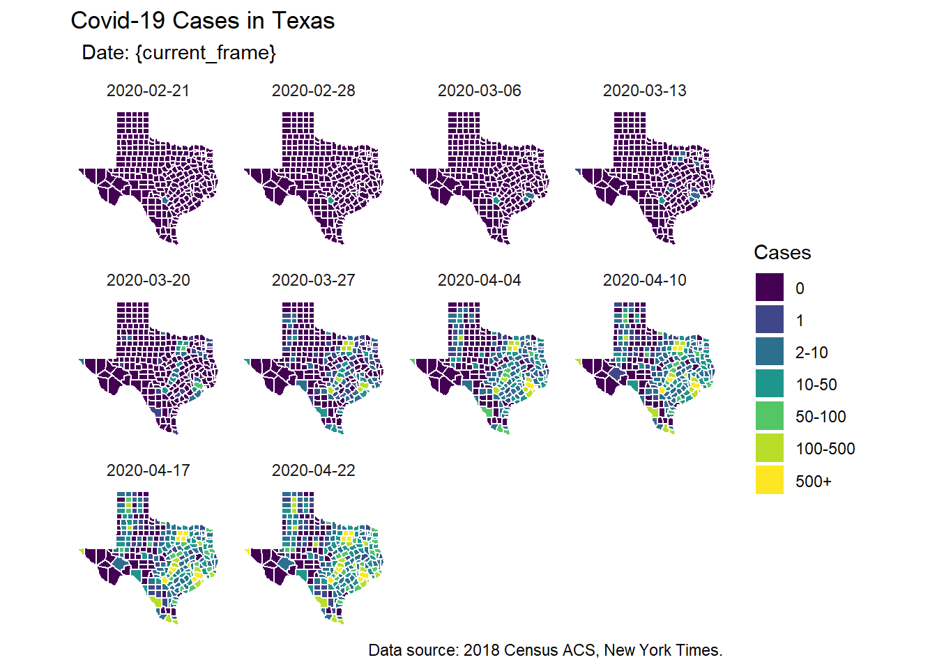
Making the map
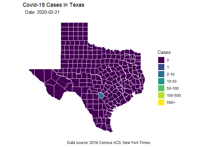
Finally, I want the map. I can use a facet version or a gganimate version.
Note that I’m using transition_manual here, which does not have any blending from one time point to another. I wasn’t able to figure out how to utilize other possible transition types in combination with geom_sf, which I utilize instead of geom_polygon because I think the map looks better here.
anim1 <- ggplot(txgeo) +
  geom_sf(aes(fill=cat),color='white')+
  scale_size_identity(.001)+
  scale_fill_manual(values=pal) +
  theme_minimal()+
  theme(panel.grid = element_blank(),
        axis.text = element_blank(),
        axis.ticks = element_blank()) +
  coord_sf(datum = NA)+
  labs(title = "Covid-19 Cases in Texas",
       subtitle = "  Date: {current_frame} ",
       caption = "Data source: 2018 Census ACS, New York Times.",
       fill = "Cases")+
#  facet_wrap(~date,ncol=4)+
  transition_manual(date) # Note that this is the only different line compared to above.
animate(anim1, duration = 18, end_pause = 4)